Proove
A habit tracker where progress is proven by video and a real person, not a checkbox
- Role
- Product Designer (solo)
- Team
- 1 — Product Designer
- Period
- 1 week
Proove is for people who want to see real progress, not collect empty checkmarks. You start a challenge habit, record short video proofs, and an assigned observer confirms them. Progress is visible at a glance — a heatmap and a streak. An iOS concept built in a week as a solo designer.
Goal
Replace the self-reported checkbox with a video proof confirmed by a real person, and make honest progress visible on a single screen.
I was responsible for
Product concept, flows and IA, key screens, a 3-tier design system (primitive → semantic → component), light/dark plus a collection of accent modes, ~40 components with variants and states.
The problem
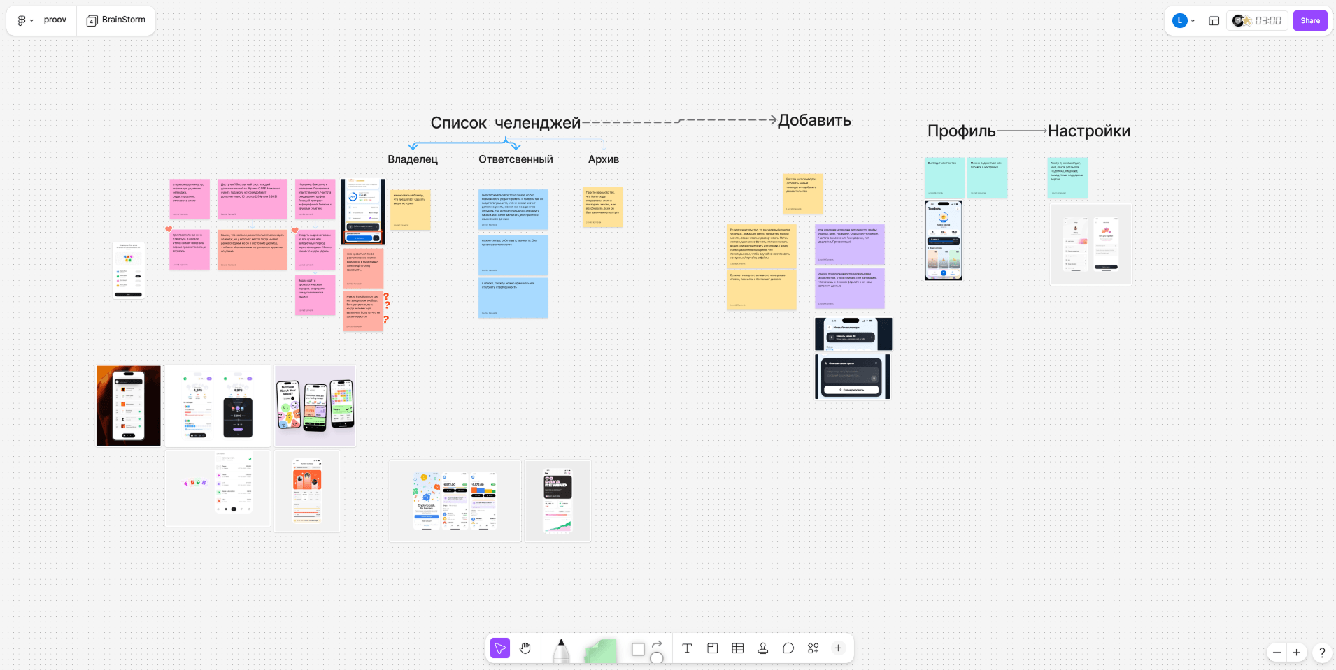
A personal trigger: a friend and I keep each other accountable — we agree on challenges and report back. But it all lived in a chat: a screenshot, “did you do it?”, an emoji. No structure, no history, no visible progress — easy to cheat, easy to drop out. The market problem: most habit trackers reward the act of tapping a checkbox, not the real action. The streak becomes the goal in itself, gets “filled in”, and the external accountability that actually works is missing. A habit is held not by a reminder, but by the person you would be ashamed to let down.

Core idea
Replace the self-reported checkbox with a video proof confirmed by a real person. The doer runs a challenge and attaches video evidence; the observer reviews and approves or rejects it. Why: video = skin in the game; a live observer = social accountability; heatmap + streak = progress visible on one screen.
Flows and IA
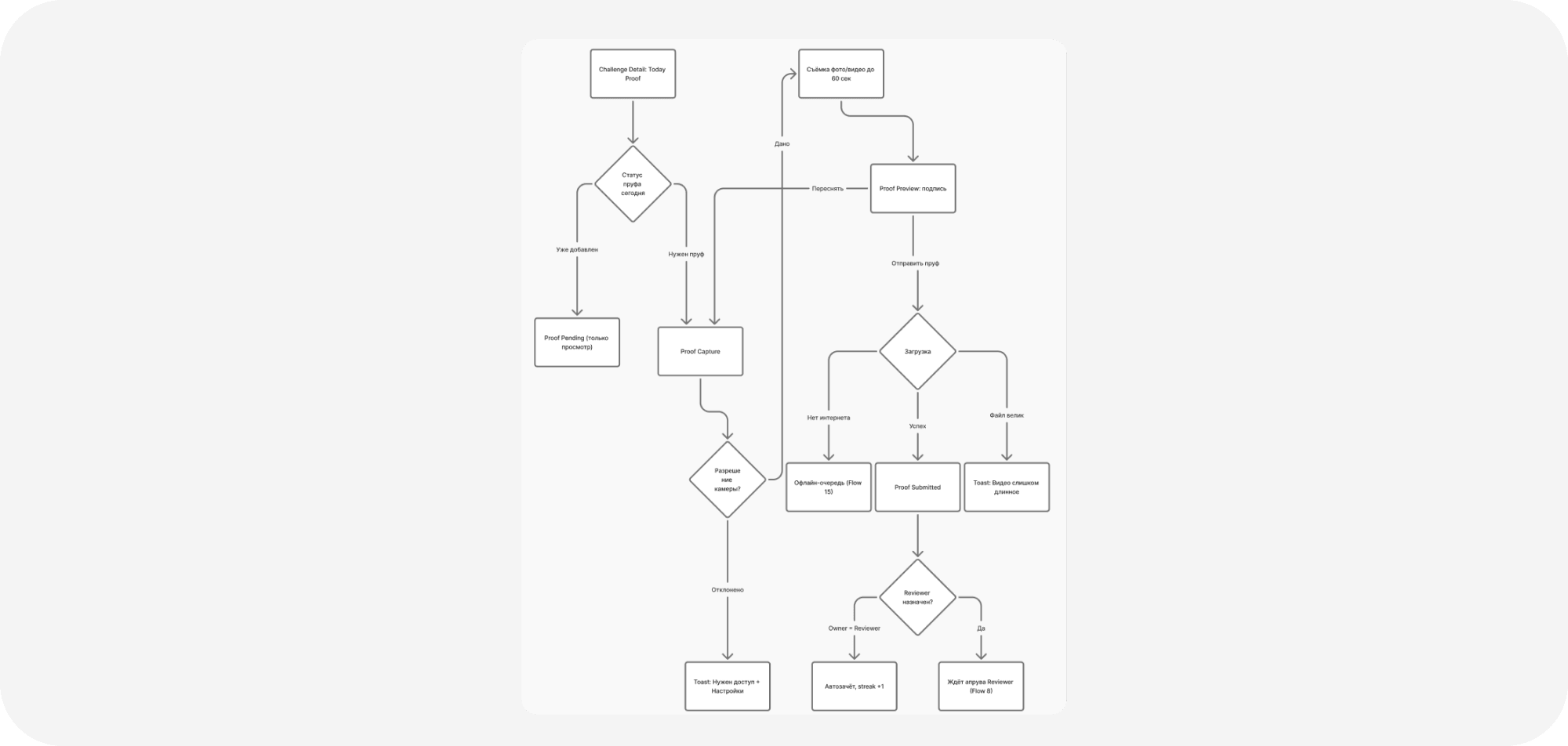
Home → Create Challenge → Challenge Detail → Add Proof → Review → Profile / Settings. Seven flows built around the happy path: start a habit, prove the action, get it confirmed.
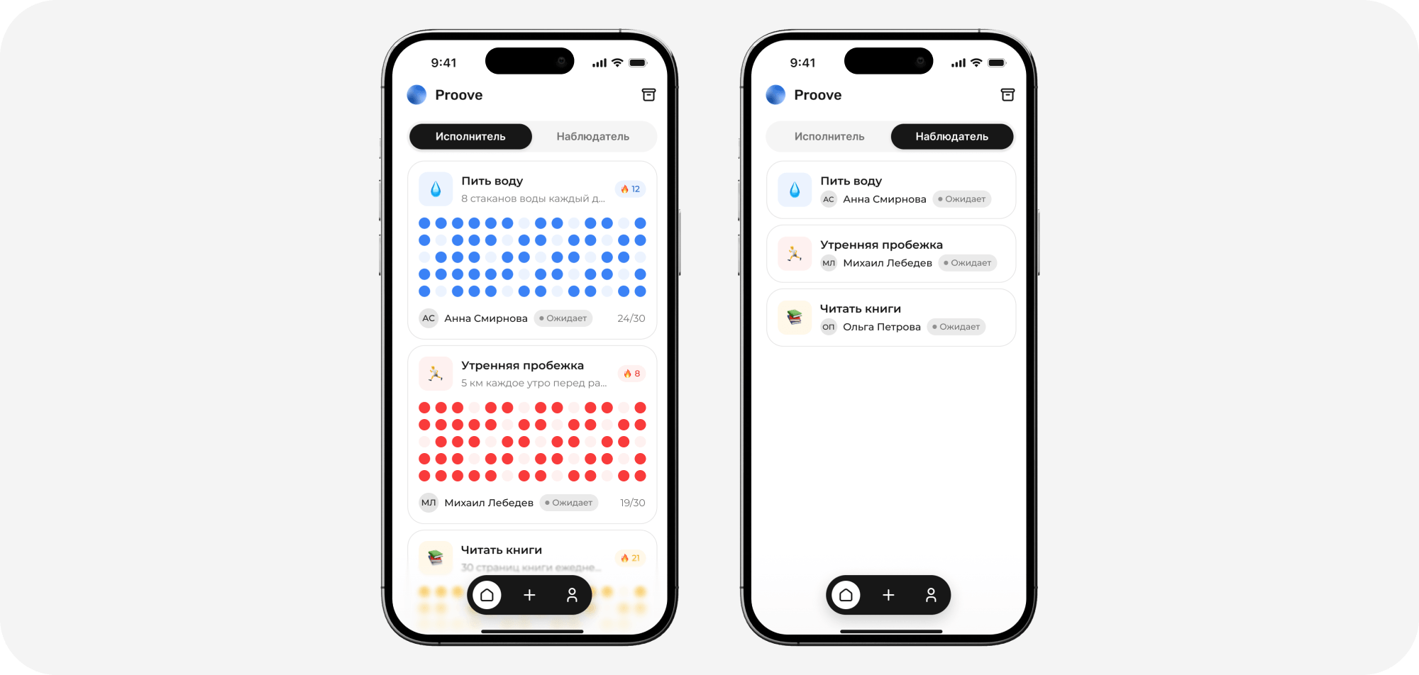
Home
Heatmap + streak instead of a single number: progress reads like a real story. Doer / Observer tabs — one app, two roles. Each challenge has its own accent color.
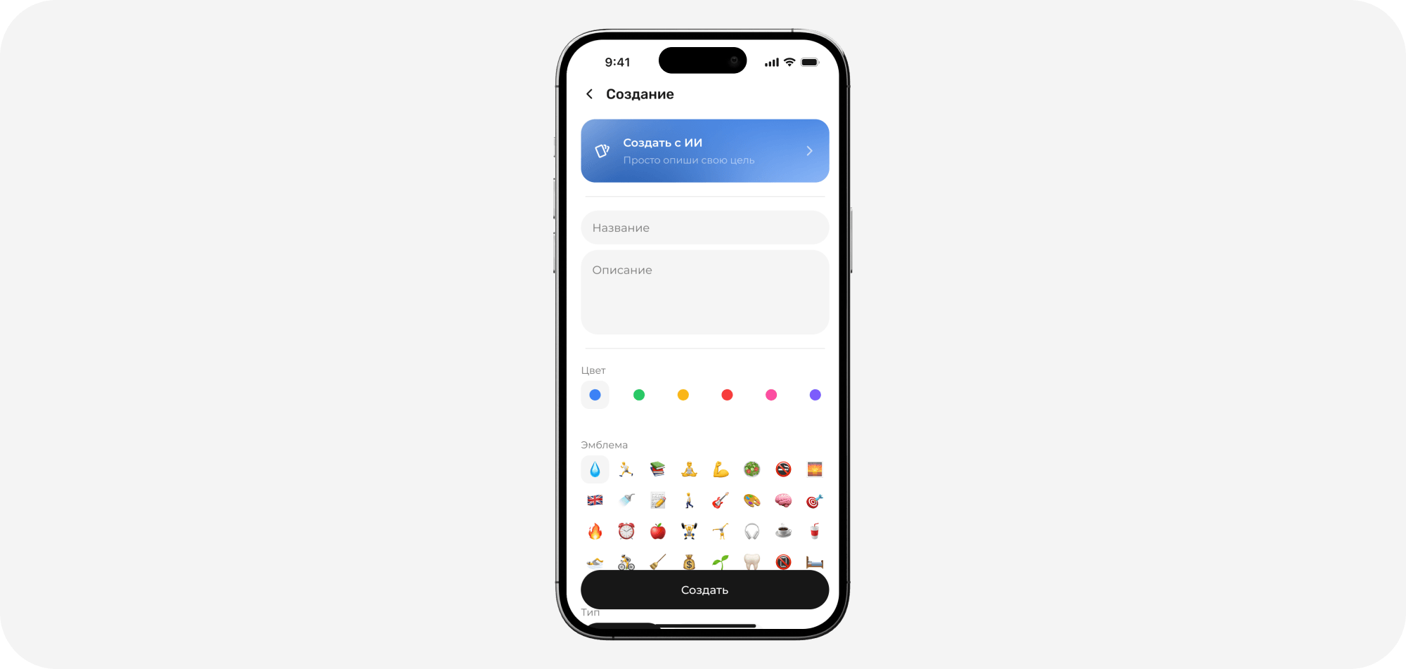
Create Challenge
An emoji + color give a challenge instant identity. Assigning an observer right at creation works as a commitment device — the pledge is made at the moment you start.
Challenge Detail
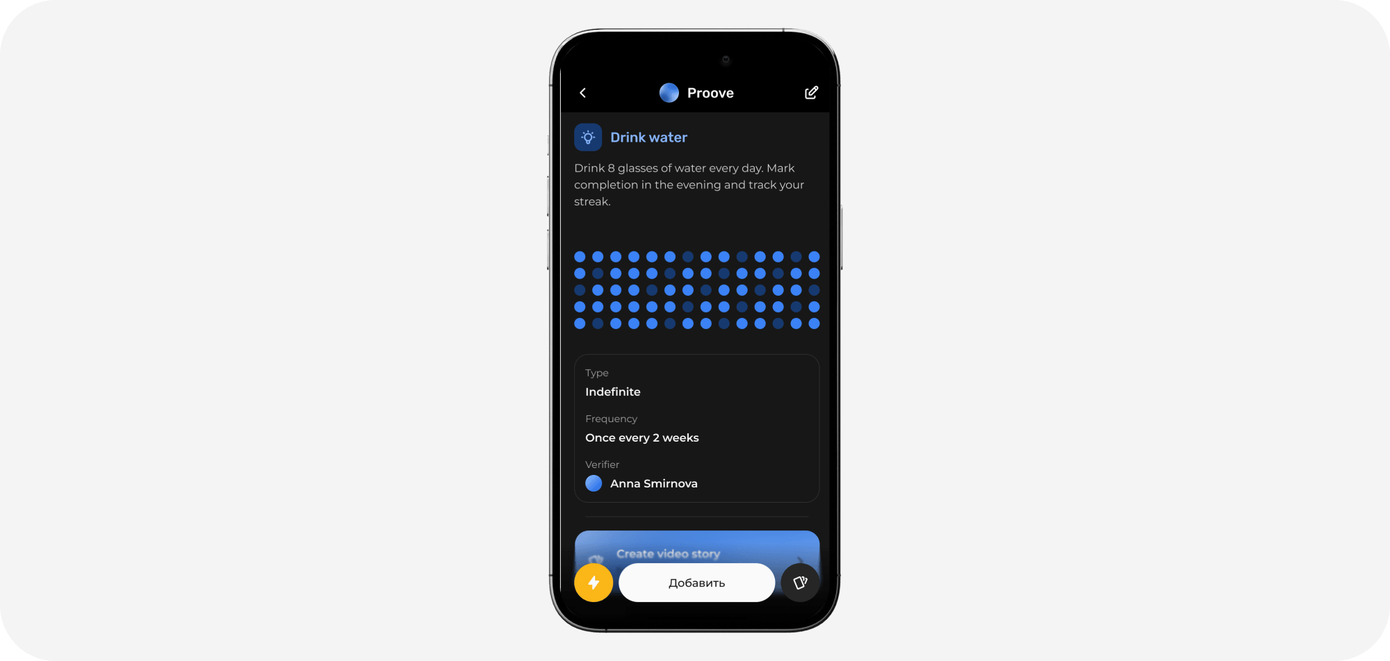
A system of 6 accent modes colors the heatmap, the title and the dots. Alongside — a gallery of video proofs by day.
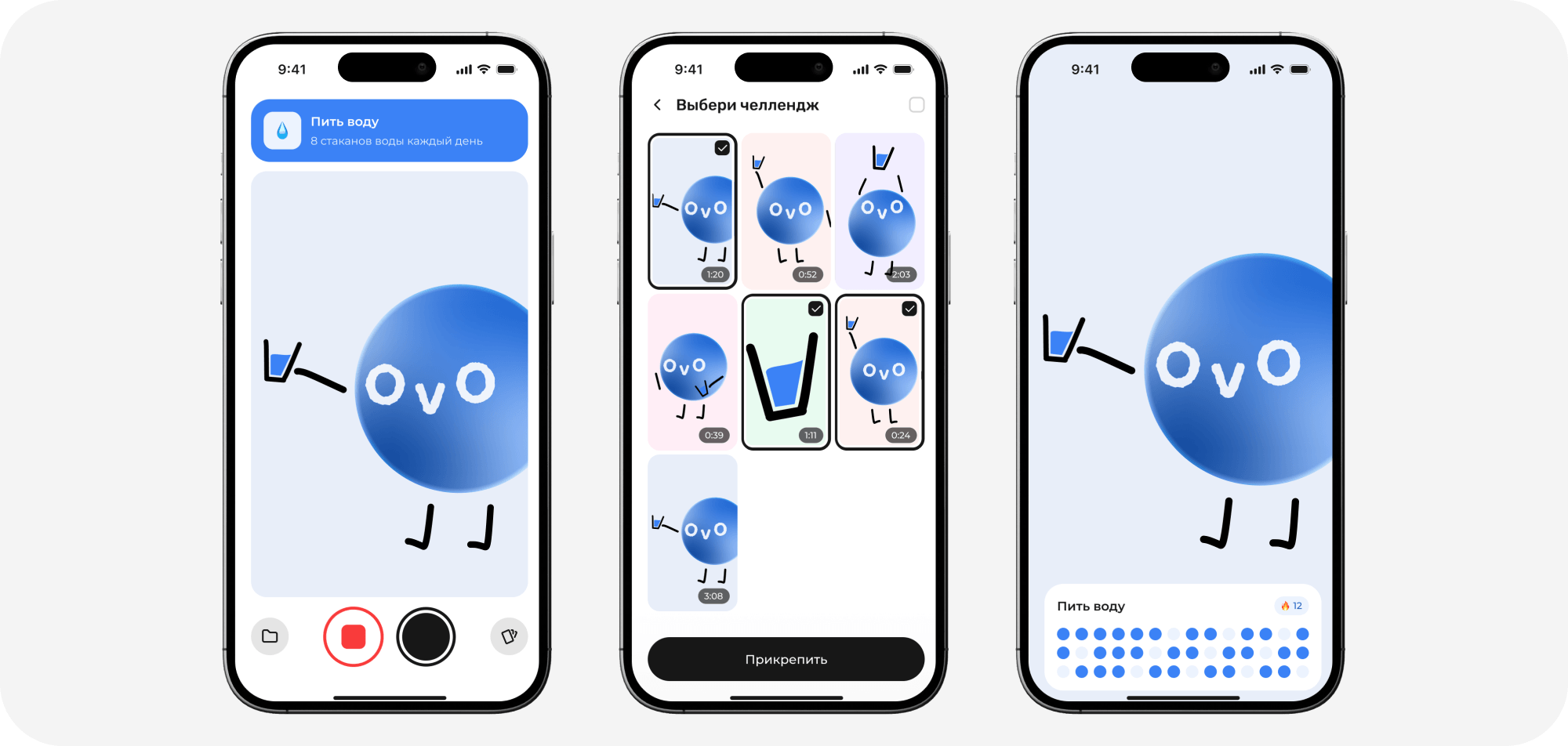
Add Proof
Camera → pick a video → preview. Video as the unit of evidence: a quick recording and the fact is locked in.
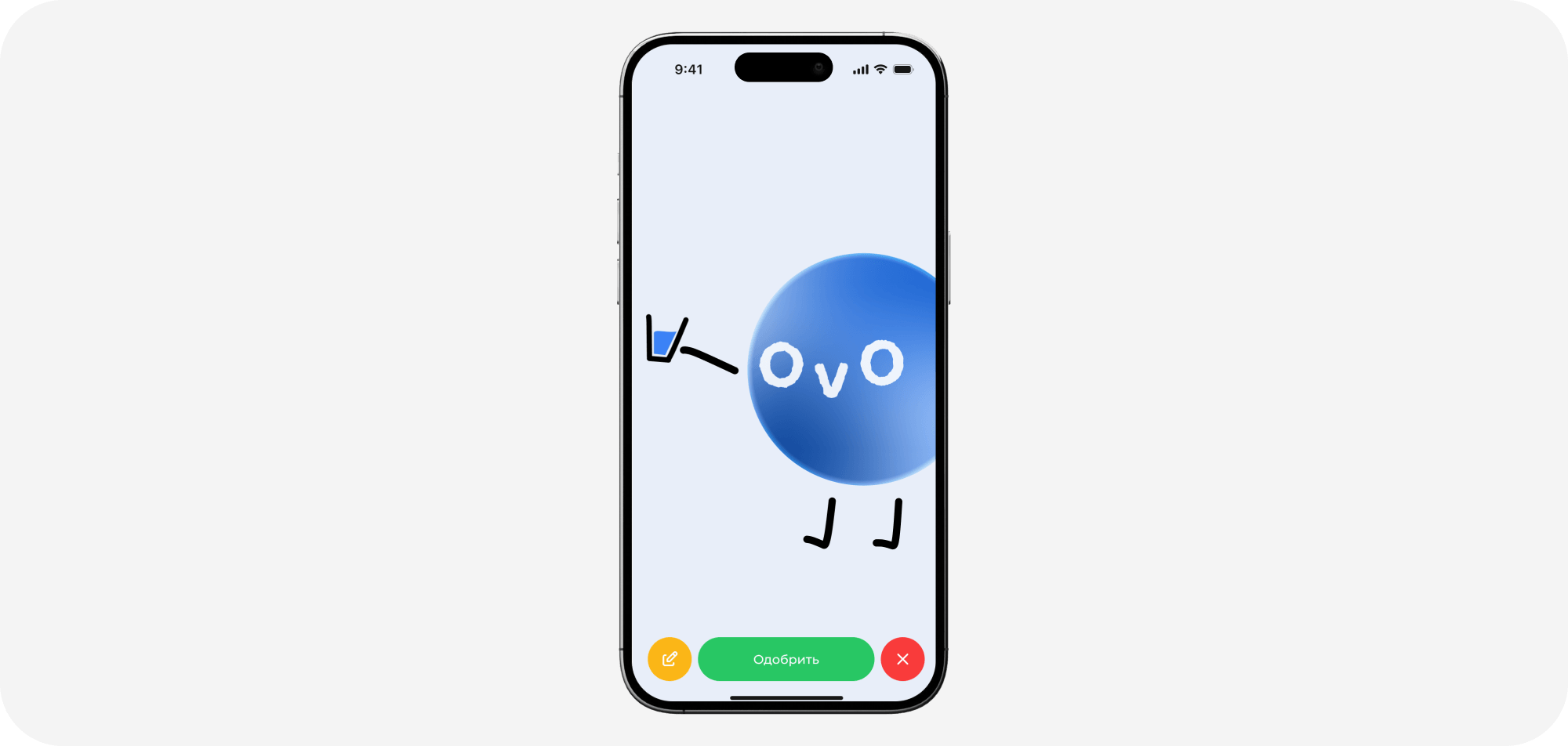
Review
Approve or reject. A human in the loop is exactly what sets Proove apart from an ordinary tracker: confirmation comes from a live observer, not an algorithm.
Design system and craft
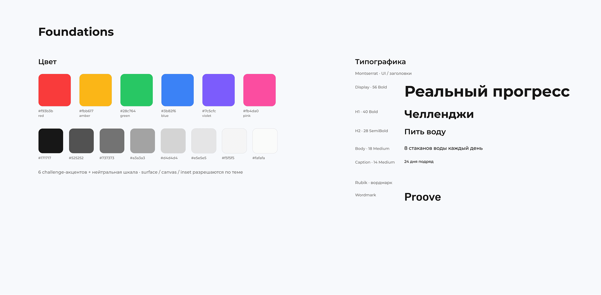
Three-tier tokens: primitive → semantic → component. Light / Dark plus a Challenge Accent collection of 6 color modes. ~40 components with variants and states. A single source of truth: every screen tells one story — the same challenges, “Drink water” as the first one, blue, open, with real observers.
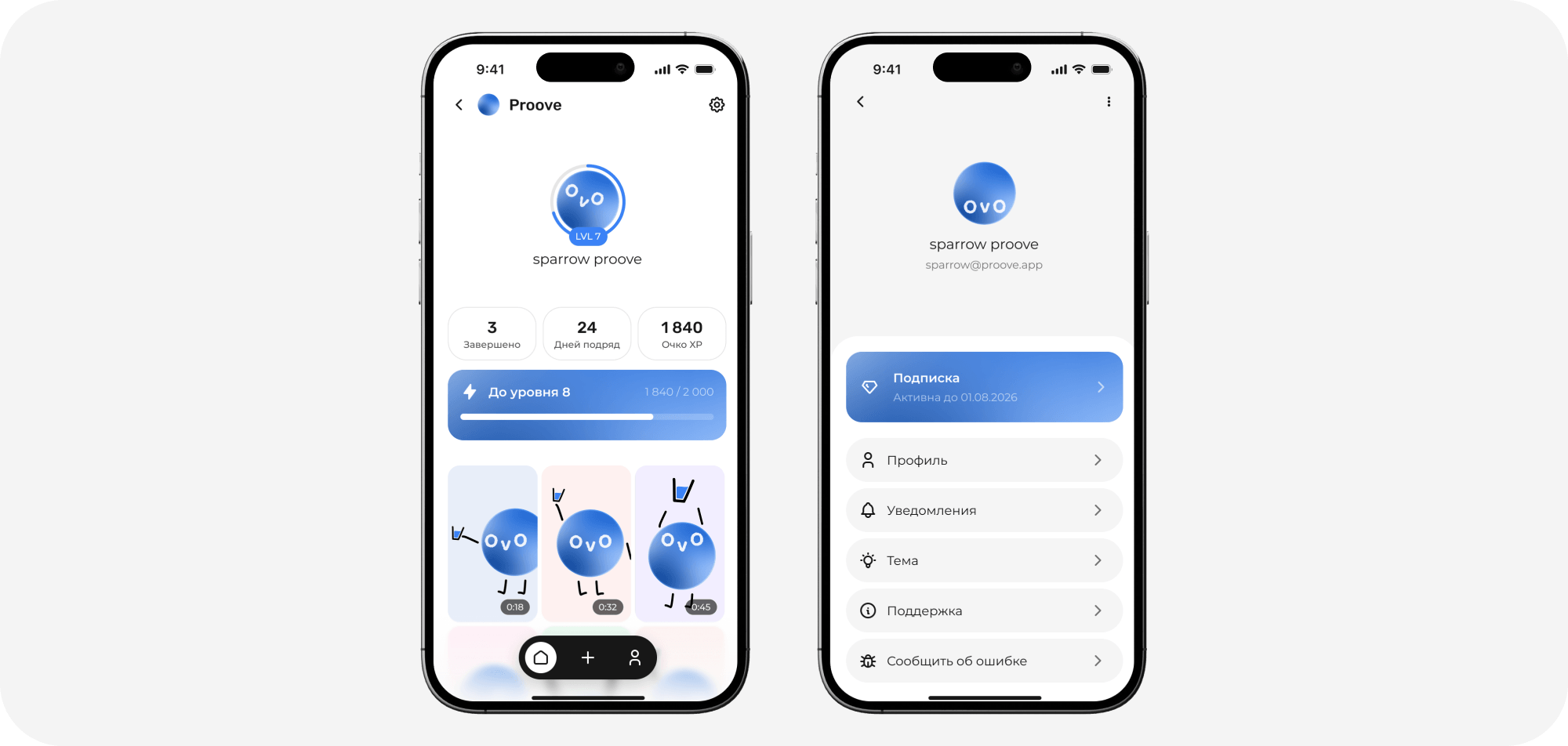
Light & Dark
Dark mode is not an “eyeball inversion” but driven by token semantics: every color knows its meaning in both themes. The editing principle — keep the visible color, fix the token's semantics, and make the change in master components so it propagates across the whole app.
Outcome
A pet project, so there are no metrics. Scattered mockups turned into a production-ready system; one coherent product narrative across 12 screens. The personal result — I solved my own problem: now we have an app, not a chat. The main lesson: on a short sprint a token system saves hours — one token versus 133 manual edits.